User dialogs
Phonometrica allows you to create custom dialogs that you can integrate into your scripts.
These can be used to obtain some input from users of your scripts.
User dialogs are created with the create_dialog() function, which takes as input a
JSON object describing the user dialog, and returns a JSON object containing the user’s
choices, if any.
Creating a dialog
We will start with a minimalist dialog that only displays some text. A dialog must have at
least two attributes: a title, which corresponds to the title of the window, and an array
of items, which may be empty. Each item is a JSON object: its type attribute indicates
which type of user interface component the object represents, and the other attributes
depend on the type of component (see below). Here, we are simply displaying a label with a
text attribute.
{
    "title": "My first dialog",
    "items": [
        { "type": "label", "text": "My first label" }
    ]
}
There are several optional attributes that can be used to customize our dialog. width
and height allow you to set the minimum width and height of the dialog, whereas
yes_no can be set to true to use Yes/No buttons instead of the default OK/Cancel.
{
    "title": "My first dialog",
    "width": 300,
    "height": 200,
    "yes_no": true,
    "items": [
        { "type": "label", "text": "My first label" }
    ]
}
Once we have created a JSON object describing our dialog’s user interface, we can pass it
to the create_dialog() function.
let ui = {
    "title": "My first dialog",
    "width": 300,
    "height": 100,
    "yes_no": true,
    "items": [
        { "type": "label", "text": "My first label" }
    ]
}

create_dialog(ui)
The resulting dialog will look something like that:
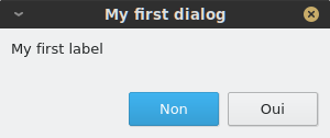
If the user presses OK (or Yes if yes_no is true), create_dialog() will return a JSON object containing the user’s input (which will be empty
in this case); if the user presses Cancel (or No), it will return the value null.
User interface components
Each user interface component has its own attributes, but there are a few important commonalities. Components which accept some user input have a name
attribute: this will be used as a key in the JSON object returned by create_dialog() to retrieve the corresponding value. In addition, components that
accept a default value have an optional default attribute that allows you to explicitly set a default value.
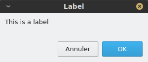
Label
A label must have its type attribute set to label. A label has one additional required attribute, text, which corresponds to the text that
is displayed inside the label.
{ "type": "label": "text": "This is a label" }
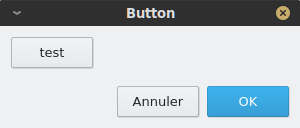
Button
A button must have its type attribute set to button. Whenever the button is pressed, the associated action is triggered. You must specify
a label attribute, which is the text that will appear on the button, and an action attribute which can be any valid string of Phonometrica code.
By default, unless the button is stored in a container, it will fill the whole width of the dialog. You can use the optional position attribute to
make it smaller and control its position. Valid values are left, center and right. If the button is inside of a container, the position attribute
is ignored.
{ "type": "button", "label": "test", "action": "print('button clicked!')", "position": "left" }
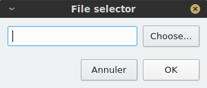
File selector
A file selector must have its type attribute set to file_selector. A file selector combines a Choose... button, which lets the user select
a file (which may or may not exist) and a field which displays the file’s path. You must specify a name attribute, which is the key that will be used in the result object to retrieve the file selector’s value, and a title which will
be displayed in the file selection dialog that opens when the user presses the Choose... button. You can specify a
default attribute (as a string): If no default value is provided, the file selector’s field will be empty. Additionally, you can specify a filter attribute
that will be used to restrict the type of files that can be selected. For example, The filter "CSV (*.txt *.csv *.tsv)" would accept
all CSV files (comma-separated value) that have .txt, .csv or .tsv extension.
{ "type": "file_selector", "name": "path", "title": "Select text file...", "default": "output.txt", "filter": "CSV (*.txt *.csv *.tsv)" }
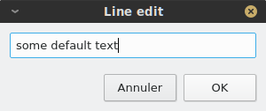
Field
A field must have its type attribute set to field. A field can be used to input a line of text.
You must specify a name attribute, which is the key that will be used in the result object to retrieve the field’s value. Additionally,
you may specify a default value.
{ "type": "field", "name": "field1", "default": "some default text" }
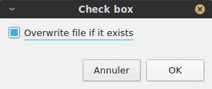
Check box
A check box must have its type attribute set to check_box. It lets you retrieve a Boolean value from the user: when the check box is checked,
the value true is returned, whereas false is returned if the box is unchecked. You must specify a name attribute, which is the key that will
be used in the result object to retrieve the check box’s value, and a text attribute which is the text that will be displayed next to the check box.
In addition, you may specify a default value, which must be Boolean.
{ "type": "check_box", "name": "overwrite", "text": "Overwrite file if it exists", "default": true }
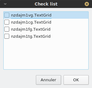
Check list
A check list must have its type attribute set to check_list. It is used to display a list of values that can be checked. You must specify a
name attribute, which is the key that will be used in the result object to retrieve the check list’s values. You must also provide a list of values
as a JSON array of strings: all checked values will be stored in the return value (again, as a JSON array of strings). In addition to the list of values,
you may specify a list of labels: in this case, labels will be displayed instead of values and values will be shown as tool tips when the user hovers
their mouse over the label. This feature can be used to display shorter values than those we actually want to store.
{ "type": "check_list", "name": "annotations",
  "labels": [ "nzdajm1vg.TextGrid", "nzdajm1cg.TextGrid", "nzdajm1fg.TextGrid","nzdajm1tg.TextGrid" ],
  "values": [
     "/home/julien/PAC/JM/nzdajm1vg.TextGrid",
     "/home/julien/PAC/JM/nzdajm1cg.TextGrid",
     "/home/julien/PAC/JM/nzdajm1fg.TextGrid",
     "/home/julien/PAC/JM/nzdajm1tg.TextGrid",
  ]
}
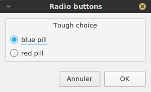
Radio buttons
A group of radio buttons must have its type attribute set to radio_buttons. It is used to display a number of exclusive options, where only one
can be selected at a time. You must specify a name attribute, which is the key that will be used in the result object to retrieve the index of the
selected value. You must also provide a list of values as a JSON array of strings. The index of the default value can be specified with the default
attribute, which must be an integer. Finally, you can add a title attribute to provide a label for the button group.
{ "type": "radio_buttons", "name": "tough_choice", "values": [ "blue pill", "red pill" ], "title": "Tough choice", "default": 1 }
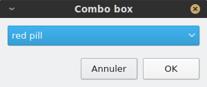
Combo box
A combo box is conceptually similar to a group of radio buttons in that it allows you to select one among several options. The choices are displayed as a list,
instead of a group of buttons. A combo box must have its type attribute set to combo_box. You must specify a name attribute, which is the key that will be used in the result object to retrieve the index of the
selected value. You must also provide a list of values as a JSON array of strings. The index of the default value can be specified with the default
attribute, which must be an integer.
{ "type": "combo_box", "values": [ "blue pill", "red pill" ], "default": 2 }
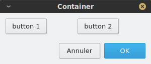
Container
A container must have its type attribute set to containter. A container is not a visible component, but is used to pack components together
horizontally (by default) or vertically. A container must have an items attribute, which is an array of components. You can use the orientation
attribute to control the container’s packing policy. It accepts two values: horizontal or vertical.
{ "type": "container", "items": [
    { "type": "button", "label": "button 1", "action": "info('A useless button!')", "position": "left" },
    { "type": "button", "label": "button 2", "action": "info('Another useless button!')", "position": "left" }
]}
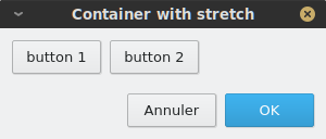
Stretch
A stretch must have its type attribute set to containter. It is a special component that can be put inside a container to fill unused space.
It has no attribute beside its type.
{ "type": "container", "items": [
    { "type": "button", "label": "button 1", "action": "info('A useless button!')", "position": "left" },
    { "type": "button", "label": "button 2", "action": "info('Another useless button!')", "position": "left" },
    { "type": "stretch" }
]}
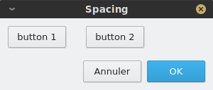
Spacing
A spacing must have its type attribute set to spacing. It is a special component that can be put inside a container to separate components.
You must specify its size attribute, which is an integer that represents the size of the spacing (in pixels).
{ "type": "container", "items": [
    { "type": "button", "label": "button 1", "action": "info('A useless button!')", "position": "left" },
    { "type": "spacing", "size": 20 },
    { "type": "button", "label": "button 2", "action": "info('Another useless button!')", "position": "left" },
    { "type": "stretch" }
]}
Putting it all together
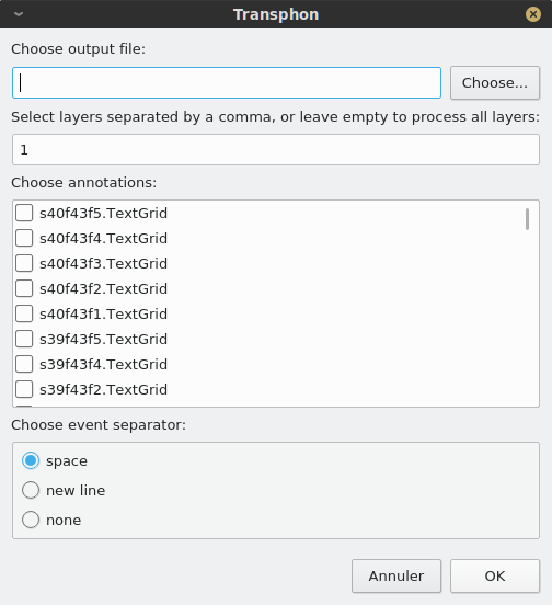
As an illustration, we will show how “Transphon”, the module that allows annotations to be exported to plain text, is implemented. We could store the user
interface in a separate JSON file and load it from a Phonometrica script, but since the user interface is relatively simple, we will create it directly
in the script. This has two advantages: it allows us to intersperse comments in the user interface, which JSON doesn’t allow, and it makes it unnecessary
to surround keys with double quotes, since in Phonometrica, { "key": "value" } and { key: "value" } are equivalent, as long as key doesn’t
contain any space.
Here is the part of the script that corresponds to the creation of the user interface:
# Setup user interface as a JSON object.
let = ui = {
    title: "Transphon",
    width: 300,
    items: [
        { type: "label", text: "Choose output file:" },
        { type: "file_selector", name: "path", title: "Select text file..." },
        { type: "label", text: "Select layers separated by a comma, or leave empty to process all layers:" },
        { type: "field", name: "layers", default: "1"},
        { type: "label", text: "Choose annotations:"},
        # Annotations will be inserted here
        { type: "label", text: "Choose event separator:"},
        { type: "radio_buttons", name: "separator", values: ["space", "new line", "none"] }
    ]
}

# Insert check list for annotations
let labels = []
let values = []

foreach annot in get_annotations() do
    let path = annot.path
    # This is the real value we are interested in
    values.append(path)
    # This is the label that will be displayed
    labels.append(system.get_base_name(path))
end

# Create item and insert it at position 6 in the list of items
let item = { "type": "check_list", "name": "annotations", "labels": labels, "values": values }
ui.items.insert(6, item)

# `result` will contain a JSON object if the user pressed "OK", or null otherwise.
let result = create_dialog(ui)

if result then
    # Process the result. Here we will simply print it.
    print(json.stringify(result))
end
And here is the dialog that appears when the script is run: